6 of the worst furniture arranging mistakes that most people make
It’s exciting moving into a new house and making it your home. But are you committing the worst furniture arranging mistakes?
We all like to think we have excellent taste when it comes to furnishing our homes. After all, our homes represent us, our character, our style and class.
But sometimes even the most confident of us can feel that something is not quite right. Perhaps it’s the layout of the room, or the artwork is in the wrong place. However much we try and pinpoint the mistake we just can’t see it.
To help you understand what works and what definitely doesn’t in your home, we’ve gone to the experts in interior design.
As a result, we have come up with the six worst furniture arranging mistakes that most people make.
Six of the Worst Furniture Arranging Mistakes
-
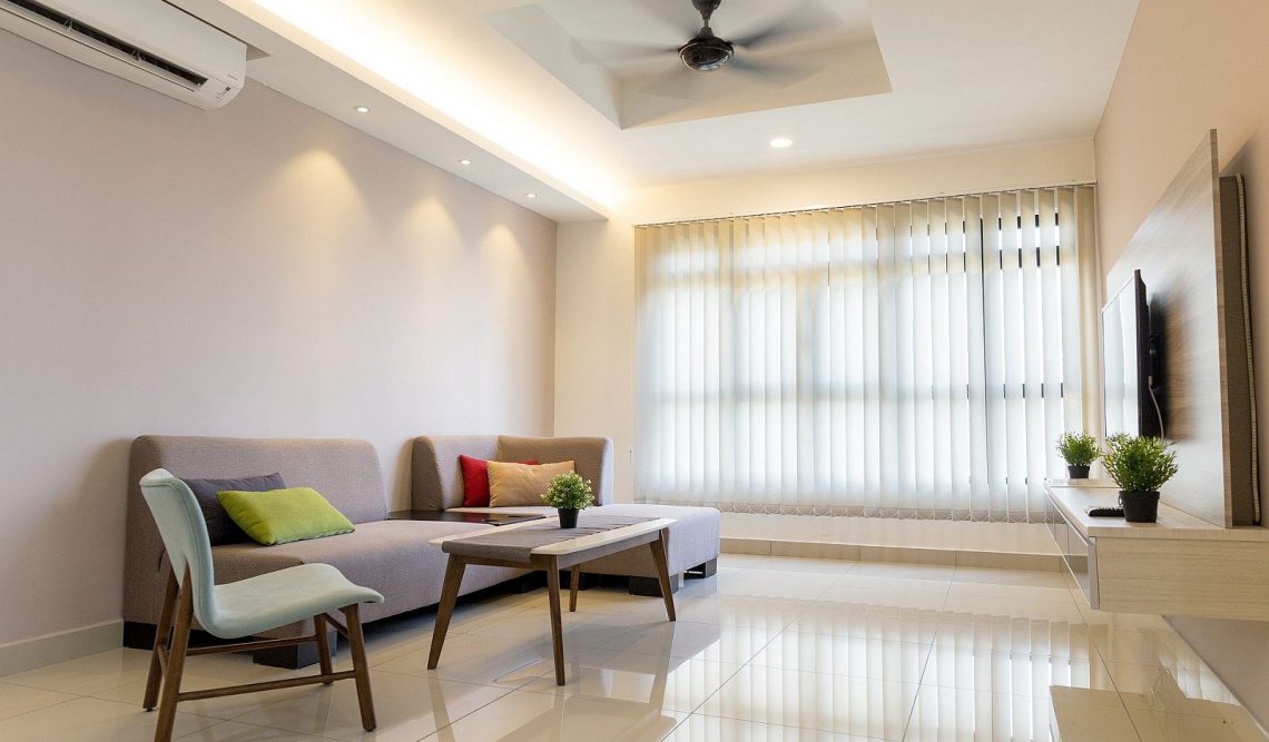
Too much furniture
One of the biggest and worst furniture arranging mistakes is to have too much of it in the first place.
Your home is not a museum or a waiting room. It should be designed specifically for your comfort and ease. And too much stuff just gets in the way.
You should aim to have a natural flow around every piece of furniture in all rooms. For example, you shouldn’t have to shimmy along the back of a wall to get to your bed.
Too many pieces can make a room feel like a spare room where you are collecting stuff, not living in it.
Interior designer Christine Stucker, co-founder of Stewart-Schafer, an architecture and design studio, suggests:
“Start with one incredible piece and build around it. For example, if you have a large sofa, you do not need to have two chairs flanking it. Instead, try adding one chair and a small side table, which will create balance in the room and allow for an uninterrupted sense of flow.”
-
Too much matching furniture
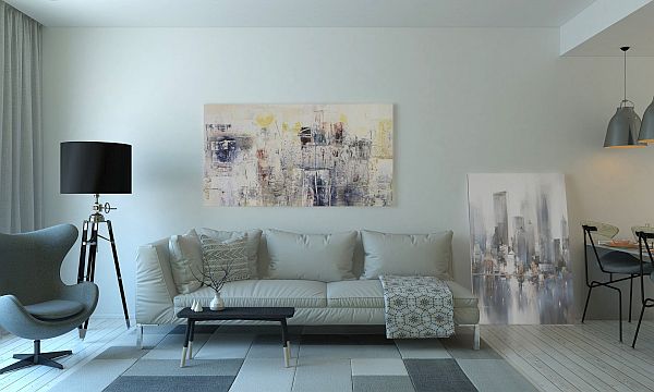
Remember decades ago when everything had to match? Sofas and settees were sold in three-piece suites? Not anymore. In fact, the more eclectic the better.
A room is so much more interesting when it comes with a collection of different furniture and furnishing styles. Nowadays it is seen as quite outdated to have your typical settee and two matching armchairs.
But if you are not an interior designer how do you make sure your home doesn’t end up looking like a yard sale?
Pick one piece that stands out, for instance, a larger chesterfield-style sofa, or some artwork, and work around this piece.
You can pick out various colours in the artwork and mix and match your complementary furniture accordingly. Or contrast colours and textures with your main item of furniture.
-
Choosing the wrong sized furniture
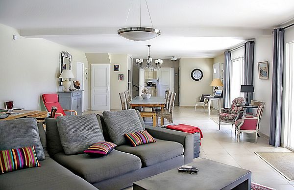
Do you live in a small apartment or flat? Is it a tiny space? Then don’t overcrowd it with furniture that is too large. You might love that over-sized couch from the vintage store but if you can’t squeeze anything else in next to it it’ll look silly.
Equally, don’t pick furniture that is too small and looks lost in a bigger room.
Becky Shea of Becky Shea Design says:
“If furniture isn’t to scale with the room, you run into a space feeling sparse or cluttered. “It’s not a good look.”
She also recommends leaving a gap of three feet between each piece for ease of movement around the room.
-
The wrong size rug
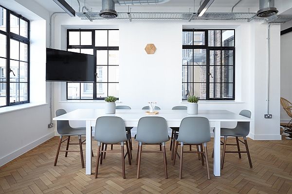
When it comes to rugs we either go too big or way too small. And most of us go small. Designers say all the time – don’t buy a rug that is too small for your space.
So just how small is too small? Experts suggest for living rooms, if the sofa is not against the wall then it should have all four legs on the rug with space around the edge so you can see the design.
For sofas that have their back to a wall make sure the two front legs are on the rug. In bedrooms, all four legs of a bed should be on the rug with about a foot of the edge showing.
-
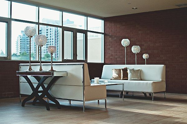
Placing all your furniture against the walls
Talking of walls and furniture, one bugbear most interior designers have is having all the furniture backing up against the walls.
This is an especially bad idea with open-plan living rooms, dining areas and kitchens.
It is much better to use your furniture to mark out boundaries and create walls. For example, place your sofa as the natural line between the living area and dining space. You can push a bookcase or side table up against the back of the sofa to really emphasise the divide.
-
Furniture in the wrong place
Finally, the last of our worst furniture arranging mistakes relate to where you put particular items. This goes back to having that natural flow in a room, but it’s also really good for your mental health, believe it or not.
Having to constantly manoeuvre around ill-fitting or in the way furniture creates bad energy. In fact, the ancient art of Feng Shui is all about placement and ease of flow around your home.
You also need to think about the usefulness of each item in relation to where it is positioned. So, for instance, as you enter the house, is the coatrack immediately available or do you have to crouch under the stairs to hang up outerwear?
In bathrooms, are towels easily accessible or do you find you are reaching out into the abyss trying to grab one off a rail that’s too far away?
Remember, in all rooms, it’s all about making your life easier and more comfortable.
